

Recently, I wrote a recipe for David Jane’s homestar.io Internet of Things platform to mimic f.lux. I’ve used f.flux on my Macbook the past few years and I like its calming light later at night, so I was keen to match my computer screen with my room lighting using a Philips Hue controlled by Home*Star.
F.lux works by shifting the color of the entire computer screen to that of a screen reflecting light at sunset. Studies have shown that the “blue” light produced by computer screens and LED lighting mimics daylight: it can keep users awake and seriously mess with their sleeping patterns. F.lux works to counteract this.
F.lux uses color temperature to describe the quality of lighting. Color temperature is often used in photography and is typically a single number in Kelvin (K) units. For example, typical values are candle light 2000K, bright sunlight 6000K and sunset 3500K — wikipedia has a list of well-known values. By applying color temperature blending to a photograph or, in f.lux’s case, to a computer screen, the effect is as if the photograph or computer screen is lit by a light of that temperature, for instance the calming effects of sunset light.
Recipes for homestar.io are implemented in Javascript and homestar.io provides utilities described using RGB to manage lighting across a wide range of color control devices such as Philips Hue and LIFx. So to write the f.lux recipe, I needed a Kelvin to RGB convertor in Javascript. Given the ubiquity of both color temperature and RGB in photography, I assumed there would be plenty of well-known algorithms available and even a standard Javascript package or two on NPM. However, neither assumption turned out to be true. So I ended up writing a Node package called color-temperature to convert the color temperature from Kelvin to RGB.
Source code is available here and the NPM package here.
An Algorithm to Convert Color Temperature to RGB
As a starting point, I used an algorithm written by Tanner Helland, the author of PhotoDemon a photo manipulation tool.
Tanner’s approach is to take a sparse color temperature and RGB mapping dataset provided by Mitchell Charity’s raw blackbody datafile and do a curve fit to the data to devise a simple algorithm that converts a color temperature in Kelvin to an RGB value. Tanner has implemented his algorithm in VisualBASIC and, additionally, commenters on his blog have further converted the algorithm to other languages such as Python.
I recommend reading Tanner’s blog post to get an understanding of the approach.
(Re)Fitting the Data
I like the approach. It is simple and gives good results, however, as Tanner commented on his blog, he felt with more tweaking the fit function could be improved — though likely at marginal gain. However, when looking at spectrum images generated form the algorithm, I did notice that some regions of the spectrum were subtly (but visibly) different to published color temperature range images especially in the region 6000-7000K. So even though the difference was very small and in a fairly narrow range of the spectrum, I decided to go back to the original mapping data and refit a curve function.
Here is the original data graphed in all its glory:

The x-axis is the Kelvin color temperature in K and Y axis is the RGB integer value between [0, 255] for each of the colors red, green, blue. From a curve-fitting perspective, this data can be thought of as four regions that need curve fitting:
(1) kelvin → red >= 6700K
(2) kelvin → 1000K < green < 6700K
(3) kelvin → green >= 6700
(4) kelvin → 2000K < blue < 6700 K
in all other areas the values are either 0 or 255.
It is hopefully clear from this graph that color temperature is not a complete colorspace, it is simply a set of RGB values that correspond to Kelvin black body temperatures: there are plenty of RGB values that do not correspond to black body radiation colors. Also the data is discrete and not every integer color temperature has a value.
A curve fit finds a continuous function that matches a set of discrete points closely. To perform the curve-fit, I used Mathematica Home Edition V10 and I used the FindFit function to find a curve fit for each of the 4 mapping regions. A curve fit function needs a general function to fit against, I used the fit function
\(a + b x + c ln(x)\)where x is the kelvin value and which in Mathematica is written as for example
FindFit[Drop[allKelvinRed, 57], a + b x + c Log[x], {a, b, c}, x];
I tweaked the data by pre-scaling the data before I did the FindFit. This achieved better results — although it limits the range of values the function will handle to above approx 1000K. The original algorithm had similar restrictions. This is no big deal, as for real world uses nothing much of interest happens below 1000K, and also the original dataset did not contain information below 1000K.
I then compared the results to both the source data and to the original algorithm output - the purpose of the latter comparison was to look for meaningful differences that would account for the visual effects I was seeing.
Below is a table comparing the new candidate curve fit for each of the regions with Tanner’s original curve fit.
| Fit Region | Orig | Candidate |
| kelvin -> red >= 6600K |
\(a x^b\)
where a = 329.698727446 |
\(a + b x + c ln(x)\)
where a = 351.97690566805693 |
| kelvin -> 1000K < green < 6600K |
\(a +b ln(x)\)
where a = -161.1195681161 |
\(a + b x + c ln(x)\)
where a = -155.25485562709179 |
| kelvin -> green >= 6600 |
\(a x^b\)
where a = 288.1221695283 |
\(a + b x + c ln(x)\)
where a = 325.4494125711974 |
| kelvin -> 2000K < blue < 6600 K |
\(a +b ln(x)\)
where a = -305.0447927307 |
\(a + b x + c ln(x)\)
where a = -254.76935184120902 |
Fit Error
So how well does the algorithm match the original data?
Below are the distributions of the fit error for each of the four regions.
I measured the fit error in terms of a count of the integer differences between the original color value and the color generated by the algorithm. This is separated out into each of the colour components: one for each of red, green, and blue. For instance an integer difference of zero means that the algorithm exactly matched the original data, a difference of one means that the value is off by 1 either above or below. e.g. if the original data gave a value of red=168 then the algorithm generating a value of 167 or 169 would both be classified as a difference of one.
I then graphed the fit error so I could visually compare the differences. The colored area of the graph is the result of the new algorithm compared to the original data and the grey area is Tanner’s findings compared to the data. In all cases, the new algorithm matches more closely and has less distribution spread than the older mappings. BTW I apologize to any visualization experts reading this — I know bar charts are the better representation for integer data, but I find the graphs kind of cool looking.
So when looking at the graphs, best results are implied for data that is higher and more concentrated in the left.

The really interesting part of the entire distribution is the area around 6700K. This is the area that I can visibly see some differences to published spectra. For the original algorithm, images became slightly more yellow than expected. The new mapping does not have this yellowness in this region. Looking in detail at this region, we can see why. The following are selected points in the region for each of the color components of red, green and blue. The first is the New mapping, the second is the original source data, and the third is the original mapping.
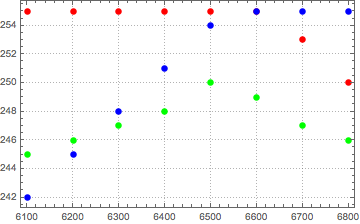
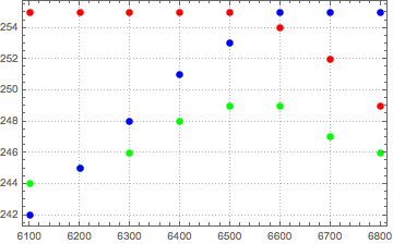
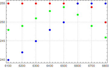
As can be seen above, in the original mapping, green stays above blue and is much higher than the source data for much of the region. The comparison between the new algorithm and the source data shows a much closer correspondence. The relative ordering of the colors at each Kelvin temperature of very close indeed.
My Mathematica notebook can be found here
Thanks
I’d like to thank Tanner for developing the approach as well as for publishing his original algorithm and making his spreadsheet and code publicly available. I’ve not used his PhotoDemon, but it looks like a great tool.